R语言临床预测模型讲义1:R语言基础
- 2026-04-15 20:09:40
注意事项:
注意大小写和空格 注意代码的完整性 注意别用中文的逗号啥的 报错了一定要仔细看看它写的啥,可以根据写的内容推断为什么报错 报错先尝试自己解决,自己解决报错也是提升Coding能力的一个非常重要的过程
课程的学习只是让你大概懂得这是什么以及R的基本使用逻辑,进一步的提升自己的能力一定是多看多用多想! 最后,相信自己一定可以学会!
1. Rstudio介绍
如何设置相关的主题?Tools – Global Option
| 1️⃣ Script(左上) | Ctrl+Enter | |
| 2️⃣ Console(左下) | ||
| 3️⃣ Environment / History(右上) | ||
| 4️⃣ Files / Plots / Packages / Help(右下) |
常用快捷键
| 运行选中代码 | Ctrl + Enter |
| 运行全部代码 | Ctrl + Shift + Enter |
| 保存脚本 | Ctrl + S |
| 清空环境变量 | |
| 注释/取消注释代码 | Ctrl + Shift + C |
<- | Alt + 减号 |
| 快速查看帮助文档 | F1 |
其他的快捷键:在Rstudio界面中点击 Tools + Keyboard Shortcuts Help可以查看所有的快捷键
2. 工作路径!✨
贯彻所有项目的重中之重,一定要理解这个工作路径 工作路径 = R默认读写文件的文件夹。当你用
read.csv()或saveRDS()读写文件时,如果没写完整路径,R就会在工作路径中查找或保存文件。
方法1:通过 RStudio 菜单设置
1 2
getwd()# 查看当前工作路径setwd()# 设置工作路径
方法2:通过 RStudio 菜单设置
操作路径:Session → Set Working Directory → Choose Directory… 选择目标文件夹即可。
3. 导入和导出文件
3.1 内置数据的演示
1 2 3 4 5 6 7 8 9 10 11 12 13 14
# 内置数据iris <- irisdemo <- irisdemo <- iris[,3:5]demo <- head(iris,50)demo <- iris[1:60,]demo <- iris[1:60,3:5]write.csv(demo,"data.csv")write.csv(demo,"data.csv", row.names =FALSE)# 相对路径的导出/适合大项目dir.create("data", showWarnings =FALSE)write.csv(demo,"data/data.csv", row.names =FALSE)
3.2 Excel格式数据的导入
1 2 3 4 5 6
library(readxl)# 读取第1个sheetdf_xlsx <- read_excel("data.xlsx",sheet =1,# 这是导入第一个sheet,或者也可以 sheet = "Sheet名"na ="NA")# NA值定义
3.3 SPSS / SAS / Stata 等
1 2 3 4 5 6 7
library(haven)# SPSSdf_spss <- read_sav("data.sav")# Statadf_dta <- read_dta("data.dta")# SASdf_sas <- read_sas("data.sas7bdat")
3.4 RDS / RData(R 原生格式)
1 2 3 4 5 6 7
# RDS单对象saveRDS(demo,"data.rds")df_rds <- readRDS("data.rds")# RData可含多个对象save(data, demo, iris, file ="data.Rdata")load("data.Rdata")
4. R语言数据结构基础
| 向量(Vector) | c(1, 2, 3)c("A","B","C") | ||
| 矩阵(Matrix) | matrix(1:6, nrow=2, ncol=3) | ||
| 数据框(Data Frame) | data.frame(ID=1:3, Age=c(25,30,35)) | ||
| 列表(List) | list(a=1:3, b=c("A","B"), c=df) |
Vector → Matrix → Data Frame → List ↑ ↑ (同类型二维) (多类型二维)
| data.frame | ||
| matrix / data.frame/list | ||
| list | ||
| vector |
4.1 数据类型的理解
1 2 3
str(data)class(data)# 查看数据的类型和大致结构
可以在Rstudio中查看相关的数据内容
1 2 3 4 5 6 7 8 9 10 11 12 13 14 15 16 17
# 向量PL <- iris$Petal.LengthPW <- iris$Petal.WidthSpecies <- iris$Species# 矩阵mat <- cbind(PL, PW, Species)class(mat)# 数据框dataframedf <- data.frame(PL, PW, Species)class(df)# dataframe再创建的时候可以命名df1 <- data.frame(Petal.Length = PL,Petal.Width = PW,Species = Species)
4.2 数据框的基本操作
先想好要做什么,再去想怎么实现你想的功能这里只介绍基本常用的功能
1 2 3 4 5 6 7 8
# 在之前已经讲了一些数据框的基本操作iris <- irisdemo <- iris[,3:5]demo <- head(iris,60)demo <- iris[1:60,]demo <- iris[1:60,3:5]#
一、载入并查看数据结构
1 2 3 4 5 6 7 8 9 10 11 12 13 14 15 16
# R内置数据集 irisdata(iris)# 查看前几行数据head(iris)# 查看后几行tail(iris)# 查看行列数dim(iris)# 150行 5列#只查看行数(有时候可以用来作为计算,有用后面会提到)nrow(iris)# 查看列名names(iris)colnames(iris)# 查看结构与类型str(iris)class(iris)
二、访问列与元素
1 2 3 4 5 6 7 8 9 10
# 访问单列iris$Species# 多列iris[,c("Sepal.Length","Sepal.Width")]# 按行列索引取值(第1行第3列)iris[1,3]# 按条件筛选subset(iris, Species =="setosa")# 筛选多个条件subset(iris, Species =="setosa"& Petal.Length >1.4)
三、添加与删除列
1 2 3 4 5
# 添加新列:花瓣面积iris$Petal.Area <- iris$Petal.Length * iris$Petal.Width# 删除列(用 NULL)iris$Petal.Area <-NULLiris <- iris[,-2]
四、数据汇总与统计
1 2 3 4 5 6
# 基本统计summary(iris)# 计算平均花瓣长度mean(iris$Petal.Length)# 按物种分组求均值aggregate(Petal.Length ~ Species, data = iris, mean)
五、排序与筛选
1 2 3 4 5 6
# 按花瓣长度升序排序iris_sorted <- iris[order(iris$Petal.Length),]# 按花瓣长度降序iris_sorted_desc <- iris[order(-iris$Petal.Length),]# 筛选花瓣长度大于5的样本subset(iris, Petal.Length >5)
六、选择性输出结果
1 2 3 4 5
# 选出前10行3列iris_sub <- iris[1:10,1:3]# 随机抽取样本set.seed(123)iris_sample <- iris[sample(nrow(iris),5),]
七、进阶推荐(tidyverse)
1 2 3 4 5 6 7 8
library(dplyr)# 前几行`setosa`中花瓣/花萼比例最高的样本。iris %>%filter(Species =="setosa")%>%select(Sepal.Length, Petal.Length)%>%mutate(Ratio = Petal.Length / Sepal.Length)%>%arrange(desc(Ratio))%>%head()
简单总结
subset()[ ] | filter() | |
[ , c()] | select() | |
iris$new <- ... | mutate() | |
order() | arrange() | |
aggregate() | group_by()summarise() |
5. 基本绘图与可视化
本章内容参考R for Data Science (2e)[https://r4ds.hadley.nz/];此外,也可以参考 https://r-graph-gallery.com/ 网站和ggplot2的官方文档[https://github.com/rstudio/cheatsheets/blob/main/data-visualization.pdf]本人认为,微信公众号的搜一搜功能是最好的R绘图参考数据库!大家可以多用用。
5.1 安装和加载必要的R包
1 2 3 4
# 注意:只需要在首次使用时安装if(!require("tidyverse")) install.packages("tidyverse")if(!require("palmerpenguins")) install.packages("palmerpenguins")if(!require("ggthemes")) install.packages("ggthemes")
除了 tidyverse,还需要使用到 palmerpenguins 包,其中包括包含帕尔默群岛三个岛屿上企鹅身体测量的数据集,以及 ggthemes 包,用于提供颜色搭配和主题搭配。
1 2 3 4
library(tidyverse)# 包含ggplot2library(palmerpenguins)# 企鹅数据集library(ggthemes)# 扩展主题view(penguins)
在开始学习前,我们先思考几个关键问题:
如何用散点图探索两个数值变量关系? 如何用图形语法表达分组差异? 如何打造符合学术出版要求的精美图表? 如何正确导出不同格式的图片?
5.2 最终绘图代码(我们的分步优化目标):
1 2 3 4 5 6 7 8 9 10 11 12 13
ggplot(data = penguins,mapping = aes(x = flipper_length_mm, y = body_mass_g))+geom_point(aes(color = species, shape = species))+geom_smooth(method ="lm")+labs(title ="Body mass and flipper length",subtitle ="Dimensions for Adelie, Chinstrap, and Gentoo Penguins",x ="Flipper length (mm)", y ="Body mass (g)",color ="Species", shape ="Species")+scale_color_colorblind()
5.3 ggplot2核心语法结构
1 2 3 4 5 6 7 8 9
ggplot2核心语法├─ 数据层 (data)├─ 映射层 (aes)├─ 几何对象 (geom_*)├─ 统计变换 (stat_*)├─ 坐标系 (coord_*)├─ 分面系统 (facet_*)└─ 主题系统 (theme_*)注释系统(annotate)
5.4 分段演示:
1 2 3 4 5 6 7 8 9 10 11 12 13 14 15 16 17 18 19 20 21 22 23 24
# 基础图层base_plot <- ggplot(data = penguins,mapping = aes(x = flipper_length_mm, y = body_mass_g))# 添加几何对象scatter_plot <- base_plot +geom_point(aes(color = species, shape = species), size =3, alpha =0.8)+geom_smooth(method ="lm", se =FALSE, color ="black")# 美化设置final_plot <- scatter_plot +labs(title ="企鹅身体形态关系研究",subtitle ="基于帕尔默群岛企鹅观测数据",x ="鳍肢长度 (mm)",y ="体重 (g)",caption ="数据来源:palmerpenguins包")+scale_color_colorblind()+theme_economist()# 使用ggthemes的经典主题print(final_plot)
5.5 ggplot2 基础绘图代码简介
如何可视化变量的分布取决于变量的类型:分类或数值
单个变量的可视化
分类变量
1 2 3 4 5
ggplot(penguins, aes(x = species))+geom_bar()ggplot(penguins, aes(x = fct_infreq(species)))+### 根据条形的频率对条形进行重新排序geom_bar()
数值变量
1 2 3 4 5 6 7 8 9 10 11
# 直方图,关键参数 binwidthggplot(penguins, aes(x = body_mass_g))+geom_histogram(binwidth =200)ggplot(penguins, aes(x = body_mass_g))+geom_histogram(binwidth =20)ggplot(penguins, aes(x = body_mass_g))+geom_histogram(binwidth =2000)# 密度图(生信中用的很多)很多图是根据这个的变种做出来的ggplot(penguins, aes(x = body_mass_g))+geom_density()
变量关系可视化指南(二维三维四维)
分类变量和连续变量的关系
1 2 3 4 5 6
# 箱线图ggplot(penguins, aes(x = species, y = body_mass_g))+geom_boxplot()# + geom_violin() + geom_jitter()# 密度图ggplot(penguins, aes(x = body_mass_g, color = species))+geom_density(linewidth =0.75)
分类和分类变量的关系
1 2 3 4 5
# 堆叠柱状图用的最多也最实用ggplot(penguins, aes(x = island, fill = species))+geom_bar()ggplot(penguins, aes(x = island, fill = species))+geom_bar(position ="fill")
数值变量和数值变量之间的关系
1 2
ggplot(penguins, aes(x = flipper_length_mm, y = body_mass_g))+geom_point()
三维或者四维的图表展示
使用点的大小(eg. 气泡图)、颜色、形状等来展示其他维度的数据,也可以绘制三维的坐标轴展示三维的数据(但太抽象我一般不用)
1 2 3 4 5
ggplot(penguins, aes(x = flipper_length_mm, y = body_mass_g))+geom_point(aes(color = species, shape = island))ggplot(penguins, aes(x = flipper_length_mm, y = body_mass_g))+geom_point(aes(color = species, shape = species))+facet_wrap(~island)
geom_( )汇总
| 函数名称 | 描述 |
|---|---|
geom_blank | |
geom_curve | |
geom_path | |
geom_polygon | |
geom_rect | |
geom_ribbon | |
geom_abline | |
geom_hline | |
geom_vline | |
geom_segment | |
geom_spoke | |
geom_area | |
geom_density | |
geom_dotplot | |
geom_freqpoly | |
geom_histogram | |
geom_qq | |
geom_bar | |
geom_label | |
geom_jitter | |
geom_point | |
geom_quantile | |
geom_rug | |
geom_smooth | |
geom_text | |
geom_col | |
geom_boxplot | |
geom_violin | |
geom_count | |
geom_contour | |
geom_bin2d | |
geom_density2d | |
geom_hex | |
geom_line | |
geom_step | |
geom_crossbar | |
geom_errorbar | |
geom_linerange | |
geom_pointrange | |
geom_map | |
geom_raster | |
geom_tile |
5.6 构建自己的美化图表代码库(分功能)
颜色
颜色可以平时收集不同的色卡,也可以直接用配色的包这里推荐一个色卡
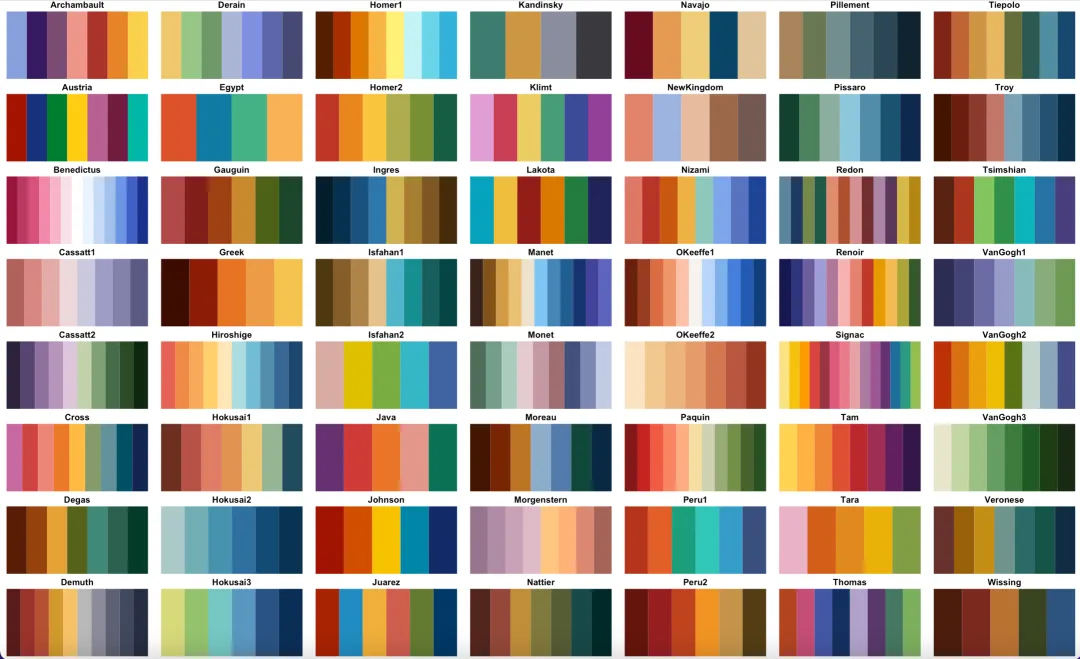
1 2 3 4
install.packages("MetBrewer")install.packages("devtools")devtools::install_github("BlakeRMills/MetBrewer")
色卡参考上图的名称,以下是官方提供的使用示例,颜色代码的本质是一个包含各种颜色16进制代码或者名称的vector向量 c("red","blue"):
1 2 3 4 5 6 7 8 9 10 11
ggplot(data=iris, aes(x=Species, y=Petal.Length, fill=Species))+geom_violin()+scale_fill_manual(values=met.brewer("Greek",3))ggplot(data=iris, aes(x=Sepal.Length, y=Sepal.Width, color=Species))+geom_point(size=2)+scale_color_manual(values=met.brewer("Renoir",3))ggplot(data=iris, aes(x=Species, y=Sepal.Width, color=Sepal.Width))+geom_point(size=3)+scale_color_gradientn(colors=met.brewer("Isfahan1"))
字体大小?坐标轴,标题字体,图例字体大小
1 2 3 4 5 6 7 8 9 10 11
font_custom <-function(base_size =12){theme(axis.text = element_text(size = base_size +4),# 坐标轴文字调节axis.title = element_text(size = base_size +6),# 坐标轴标题plot.title = element_text(size = base_size +8,# 主标题face ="bold",hjust =0.5),legend.text = element_text(size = base_size +2),# 图例文字legend.title = element_text(size = base_size +4)# 图例标题)}
坐标轴边框范围和刻度
1 2 3 4 5 6 7 8 9 10 11 12 13 14 15
theme(# 显示顶部和右侧轴线axis.line.x.top = element_line(color = line_color,size = line_size),axis.line.y.right = element_line(color = line_color,size = line_size),panel.border = element_blank(),# 隐藏默认panel边框scale_x_continuous(#limits = c(0,10),expand =c(0.02,0)),# 控制轴两侧留白scale_y_continuous(#limits = c(0,10,expand =c(0.02,0))
标题和名称
1 2 3 4 5 6 7
labs(title ="Penguin Morphology Relationship",subtitle ="Palmer Station Antarctica",x ="Flipper Length (mm)",y ="Body Mass (g)",color ="Penguin Species",# 图例标题shape ="Penguin Species")
图例的编辑
1 2 3 4 5 6 7 8
legend_custom <-function(){theme(legend.position ="bottom",# 图例位置legend.box ="horizontal",# 图例排列方向legend.background = element_blank(),# 清除背景legend.key = element_blank()# 清除图例键背景)}
图片的导出
1 2 3 4 5 6 7 8 9 10 11 12 13 14 15 16 17 18 19 20 21 22 23 24 25 26 27 28 29 30 31 32 33 34 35 36 37
# pdf格式,矢量图,可编辑,强烈推荐ggsave(filename = paste0(base_name,".pdf"),#在这里给图片命名plot = p,device = cairo_pdf,path = output_dir,width =8,height =6,useDingbats =FALSE)## pdf 格式的图片不用设置dpi,因为是矢量图,以下tiff和png都是需要设置dpi的# 保存为TIFF格式(论文出版),文件较大,不是很推荐,其实不是很清晰ggsave(filename ="plot.tiff"),#在这里给图片命名plot = p,device ="tiff",path = output_dir,dpi =600,# dpi 一般期刊要求300以上,我一般选600width =17.4,# 根据自己的图片调height =12,units ="cm",compression ="lzw"# 无损压缩)# 保存为PNG格式,我一般保存pdf和png双格式,这个格式非常清晰,且占用空间极小,适合用于PPT的制作,非常推荐ggsave(filename ="plot.png"),#在这里给图片命名plot = p,device ="png",path = output_dir,dpi =600,width =2400,# 像素单位,自己调一下height =1600,units ="px",bg ="white"# 设置背景色(透明背景用"transparent"),默认好像是透明色)
论文图表设计清单
在提交论文前,请检查:
所有文字字号是不是拼成大图后太小看不清 坐标轴标标题包含单位等完整信息 图例标题具有实际意义 如果是多维度数据,是否同一个变量被重复可视化? 颜色在黑白打印下可区分 图片分辨率≥300dpi(位图)放大150%后任然能够看清楚文字等细节
5.7 构建目的引导、大语言模型辅助的代码习惯
实际上,代码语言本质上只是一个工具。你真正需要掌握的,并不是“写代码”本身,而是如何利用代码去解决问题。如果长期停留在机械复现他人代码、反复照抄示例的阶段,很容易陷入“看似很努力,实则没有进步”的困境。
在这一期课程中,我会专门和大家讲一件越来越绕不开的事情:如何正确地使用大语言模型(LLM)来辅助生成代码。
正如我之前反复强调的,大语言模型的使用门槛极低。只要你愿意输入一句话,它就可以给你生成上百行、甚至上千行的代码。但问题恰恰出在这里——代码是写出来了,但你并不知道它在做什么,更无法判断它是否在“正确地做你想做的事”。久而久之,这反而会成为你学习一门编程语言的最大阻碍。
我对此印象非常深刻。有一次,一位研一的师弟来找我,导师让我带他“简单入个门”。我当时的建议很朴素:先学 R,随便看看入门视频,遇到问题就用 ChatGPT 写代码即可。
两天后我去他工位看了一眼,发现他已经开始“赛博炼丹”。他直接给 GPT 抛出了一个极其宏大的研究目标,GPT 回了他一段结构复杂、依赖繁多的代码;他把代码原封不动复制运行,报错后再把报错完整粘给 GPT;GPT 又在原代码上打了一堆补丁;然后继续报错……如此循环,最后代码依旧没跑通,他本人也彻底陷入了挫败状态。
后来我仔细复盘了一下,这件事的核心问题并不在于 GPT,也不在于 R,而在于一句话:
他根本不知道自己“具体想做什么”。
只有当你明确了“我要完成什么目标”,你才会有动力、也有方向去学习新的技能,并判断一段代码到底是“对我有用”还是“看起来很厉害”。
学习 R 也是完全一样的逻辑。你不是在学一门语言,而是在借助一门语言完成任务。
R 和 Python 在能力边界上远比大多数初学者想象得要宽,它们几乎可以完成你在科研与临床研究中能想到的所有分析任务。因此,真正困难、也真正重要的,并不是语法本身,而是:
如何把你的研究目标,拆解成清晰、可执行、可被代码实现的需求。
基于我这些年在临床预测模型教学与科研实践中的经验,我将 R 语言在临床预测模型中的“需求” 总结为以下几个核心类别。你可以把它们理解为:你向大语言模型提问、向代码发号施令时,最常用的“问题模板”。
目标/场景:告诉LLM他的角色是什么(擅长R语言的临床医生),告诉它我要解决什么问题,用在什么场景(论文/汇报/上线脚本)。 任务类型:清洗 / 探索分析 / 建模 / 可视化 / 自动化脚本 / Debug。 数据与结构:数据来源、对象名/路径、行列规模、关键字段解释;给 head()/str()或 3 行样例。语言与环境:R/Python/SQL;版本;操作系统;能否安装包;是否离线。 约束与偏好:速度/内存/可读性优先级;不要用哪些包;是否函数化;是否需要注释。 方法与细节要求:分组定义、缺失值策略、统计方法/模型、参数范围、随机种子、绘图风格。 输出要求:需要输出什么(对象/图/表/文件);文件名;格式(csv/xlsx/pdf);是否要中英文注释。 验收标准:我用什么来判断做对了(例如列数、行数、指标范围、示例输出长什么样)。 潜在问题/已知报错(如有):报错信息、你已经尝试过什么。
1
你是一个擅长R语言的专家,我现在有一个名为 df 的数据框(粘贴你的数据的head(df))(示例:大约 120 行、至少包含两列:分组变量 Group=“A/B/C”和连续数值变量 QoR15_24h),想用 R(优先 ggplot2,可用 ggpubr)画一张可用于论文/汇报的箱线图:横轴为 Group,纵轴为 QoR15_24h;要求同时叠加抖动散点以展示个体分布,箱线图不显示离群点(避免遮挡),并在图上标注统计学比较结果(先做三组总体差异检验 Kruskal-Wallis,再做两两 Wilcoxon 检验并进行 BH 校正,标注为格式化 p 值或星号均可);请在代码里先处理常见问题(将 Group 设定为因子并固定顺序 A、B、C;将 QoR15_24h 强制为数值型并剔除 NA),然后生成图对象并保存为矢量格式 PDF(文件名 fig_boxplot_QoR15_24h.pdf,尺寸约 6×4 inch);整体风格简洁,配色采用低饱和度的顶刊适用配色,标题与坐标轴标签清晰,输出为一段可直接运行的完整 R 代码。
